iOS & Android
Worksphere
My Role
UX Lead - Interaction Design
Visual Design, User Flows, Prototyping
Project Duration
Sept 2023 - Feb 2024
Overview
Worksphere a powerful productivity tool designed to help you effortlessly manage tasks, calendars, and team collaboration in one integrated platform. It streamlines complex workflows and provides a flexible, intuitive experience to boost your productivity, to keep you focused on what matters most.
The Problem
When I joined Worksphere as a UX Designer, I was tasked with revitalizing their productivity tool, which initially featured only a logo and a minimal user interface. My mission was to transform this nascent product into a sophisticated and user-friendly solution. I spearheaded several design initiatives to enhance usability, functionality, and overall user experience throughout the course of the project.
Onboarding
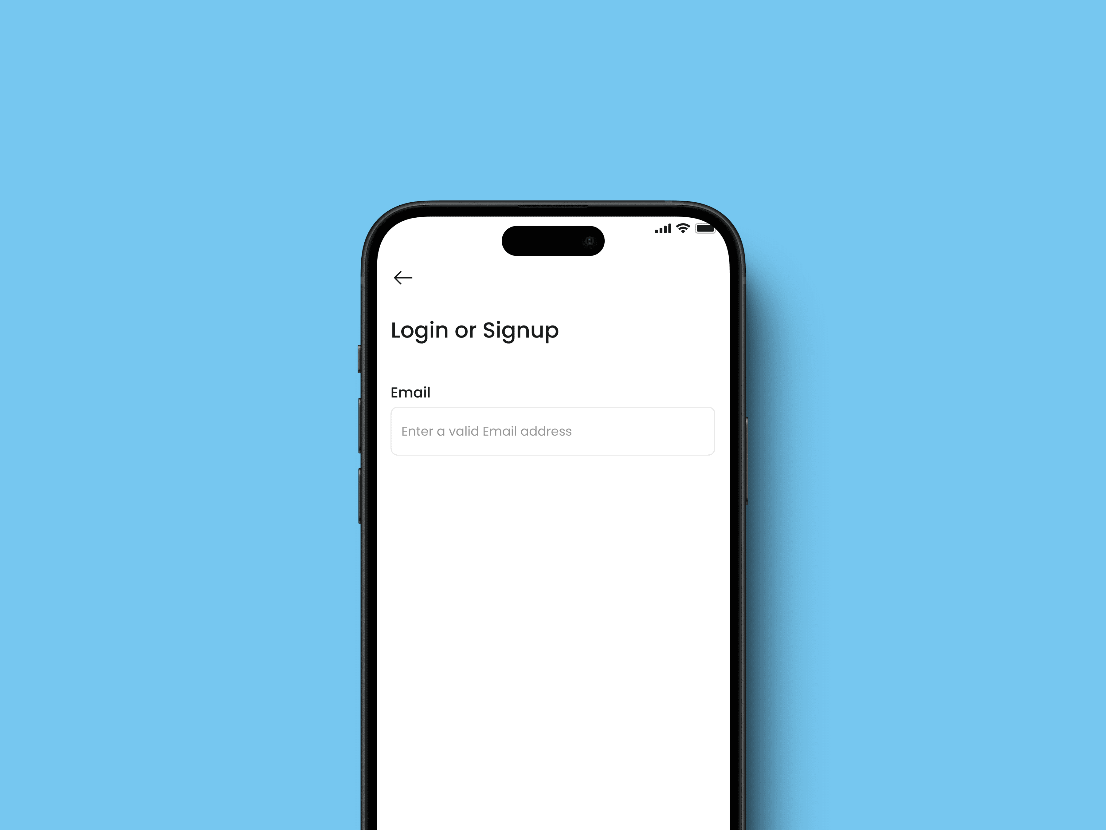
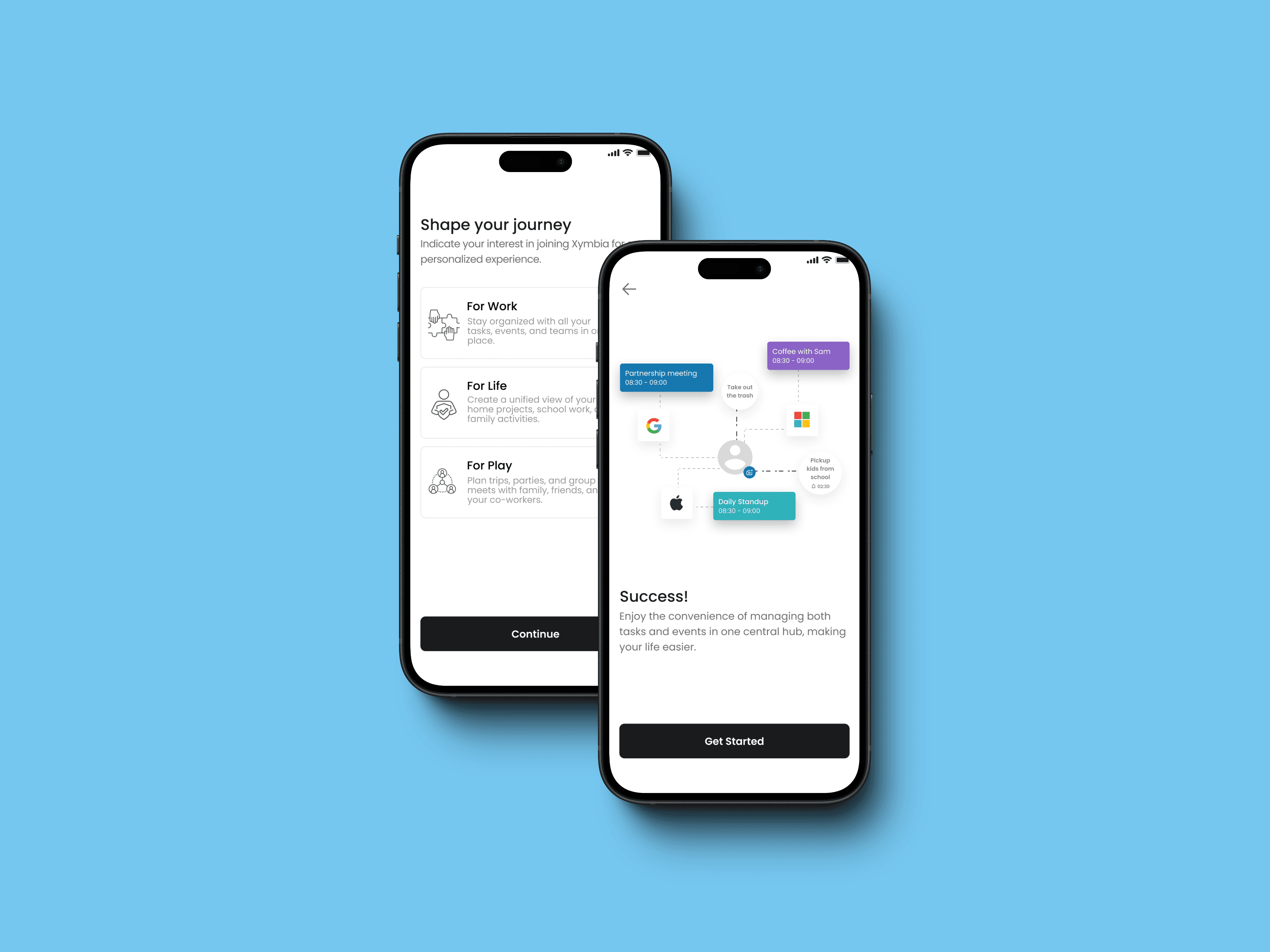
When I began, there was no onboarding process, which led to user confusion and a lack of engagement. To address this, I designed an onboarding experience that would engage users right from the start.
I crafted a series of screens to clearly indicate the purpose of the product, providing users with a personalized experience. Key features included automatic detection for login or sign-up via email, significantly reducing cognitive load, and integrating calendar linking during onboarding to streamline the setup process. Additionally, I offered a preview of the product's value proposition.
Upon reflection, I realized that reducing the number of onboarding screens would help prevent drop-offs due to lengthy processes. I recommended moving the calendar setup to a later stage within the app, ensuring a smoother initial experience.
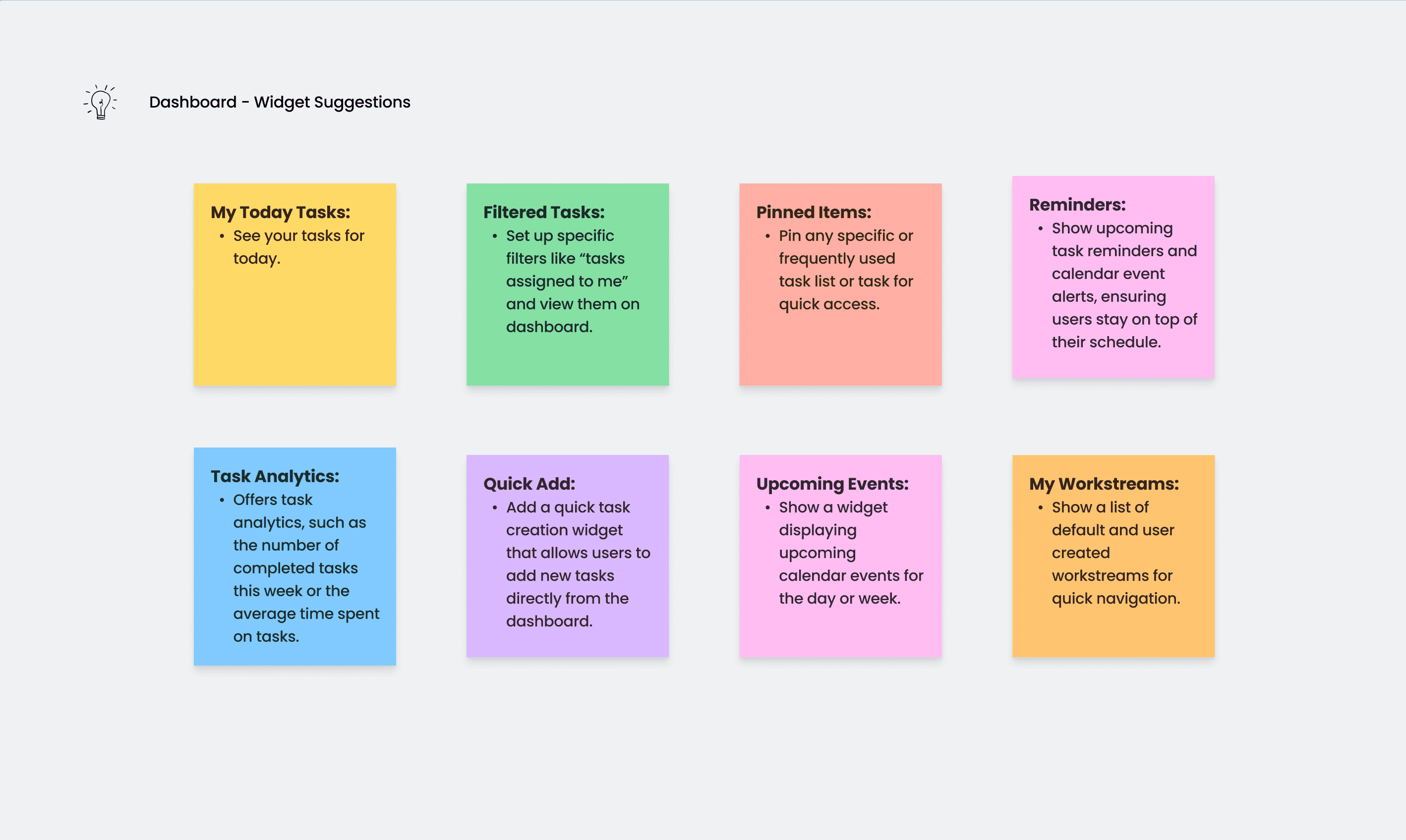
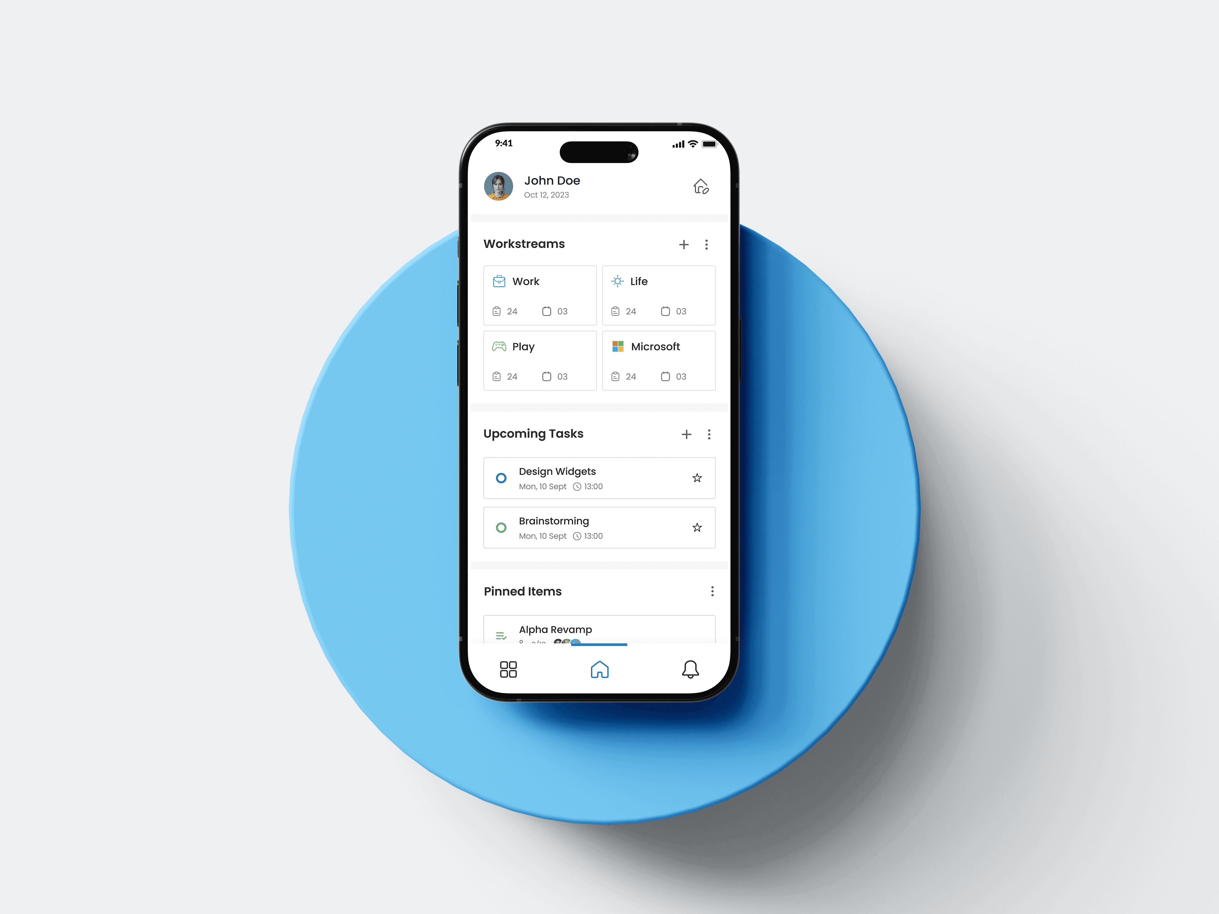
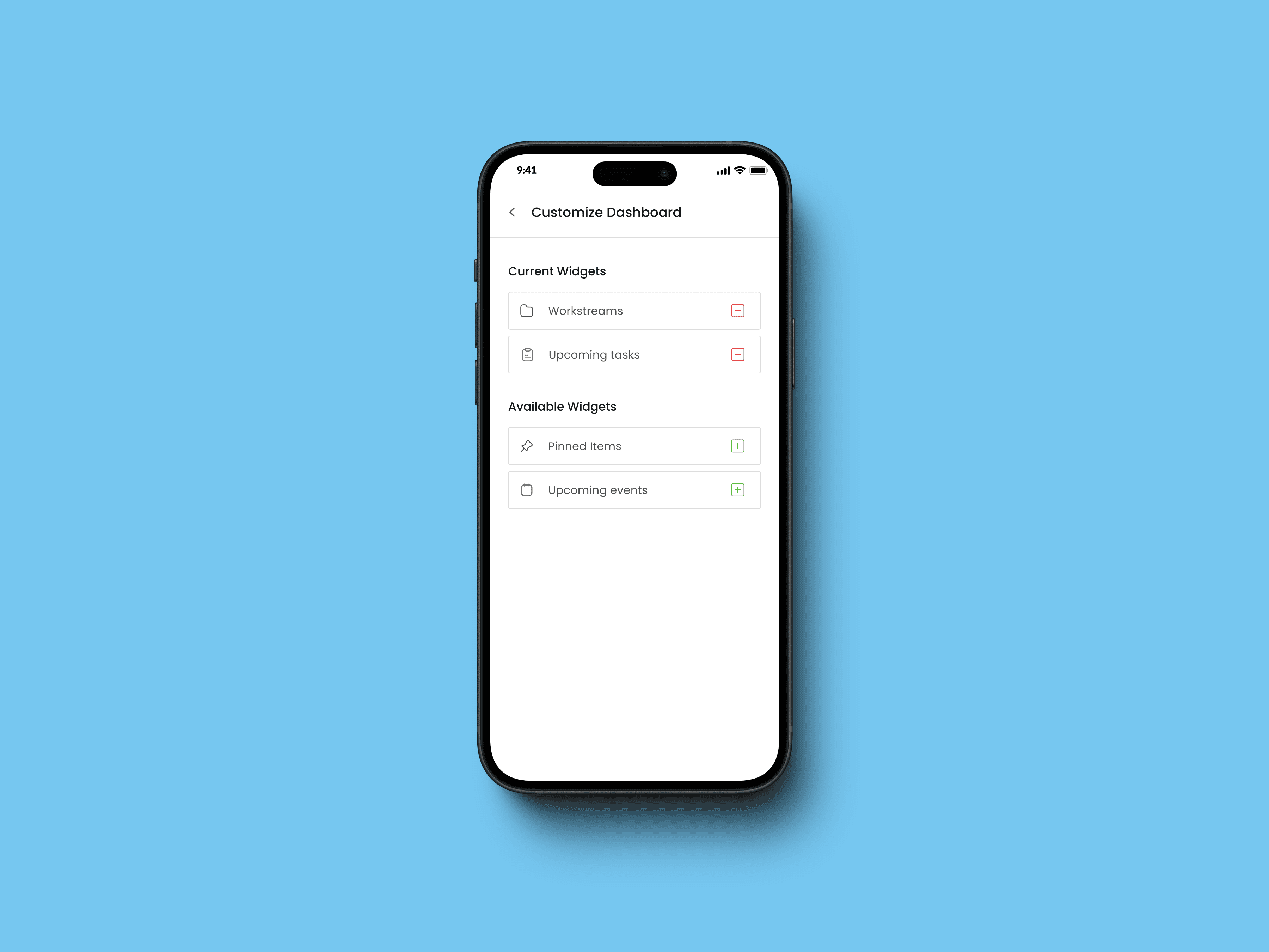
Crafting a Personalized Dashboard
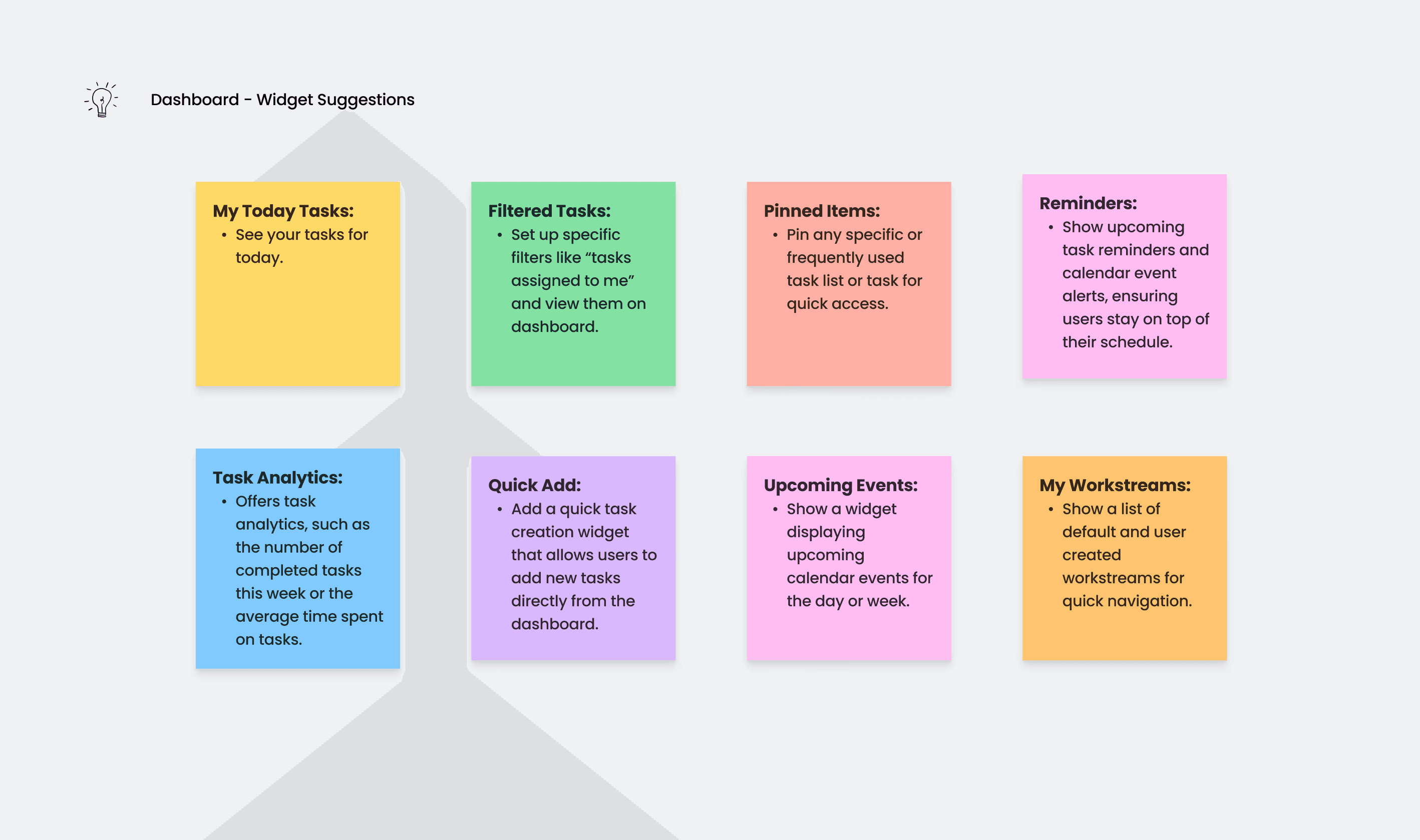
Initially, the tool lacked a functional and engaging dashboard. To address this, I designed a dashboard that was both exclusive and valuable. I introduced pluggable widgets, allowing users to customize their dashboard based on their preferences and priorities.
This approach not only handled the complexity of the tool but also offered users the freedom to arrange their dashboard to best suit their needs. By implementing this flexibility, users could focus on what mattered most to them, enhancing their overall experience with the product.
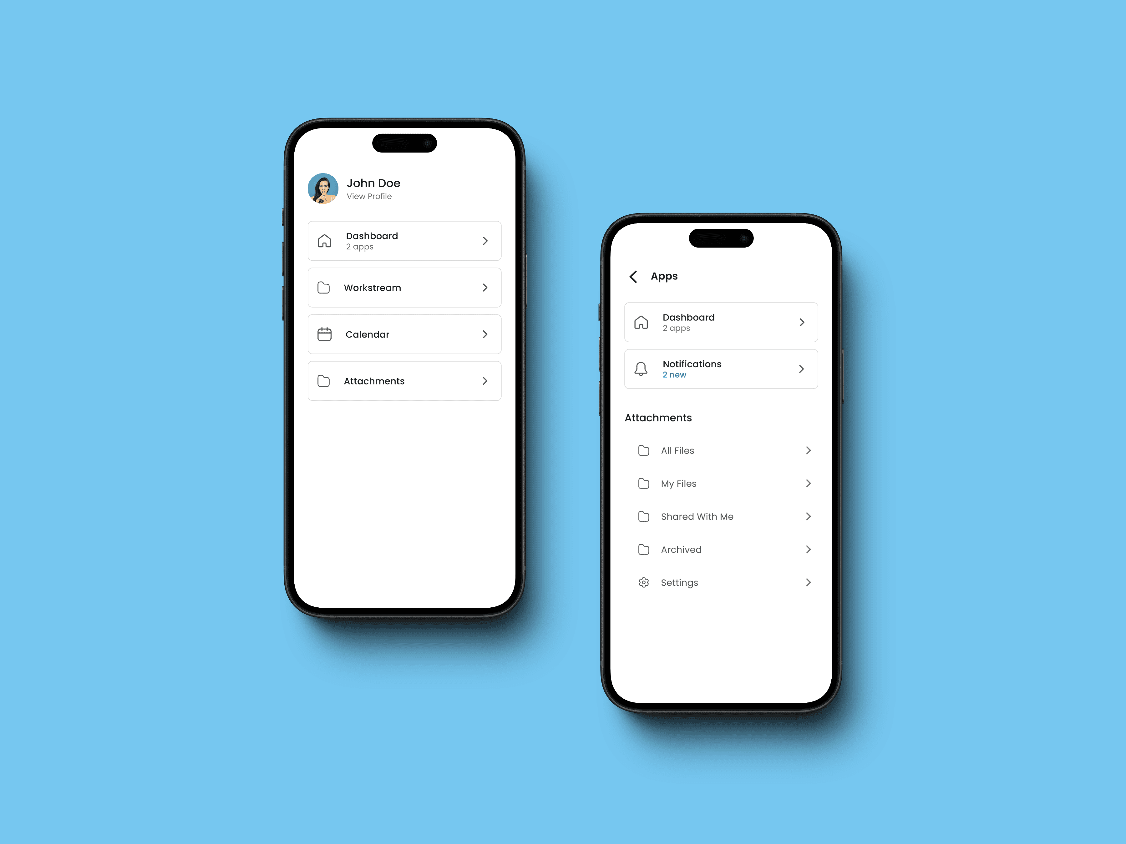
Implementing an Intuitive Navigation System
Given the planned expansion of the app to include multiple modules, navigation was a critical concern. The existing system was cumbersome, making it difficult for users to move seamlessly between different parts of the app.
To resolve this, I designed a nested navigation system featuring a global navigation menu for accessing all modules. Once inside a module, users encountered in-app navigation complemented by a back button, facilitating smooth transitions and reducing navigation-related frustration.
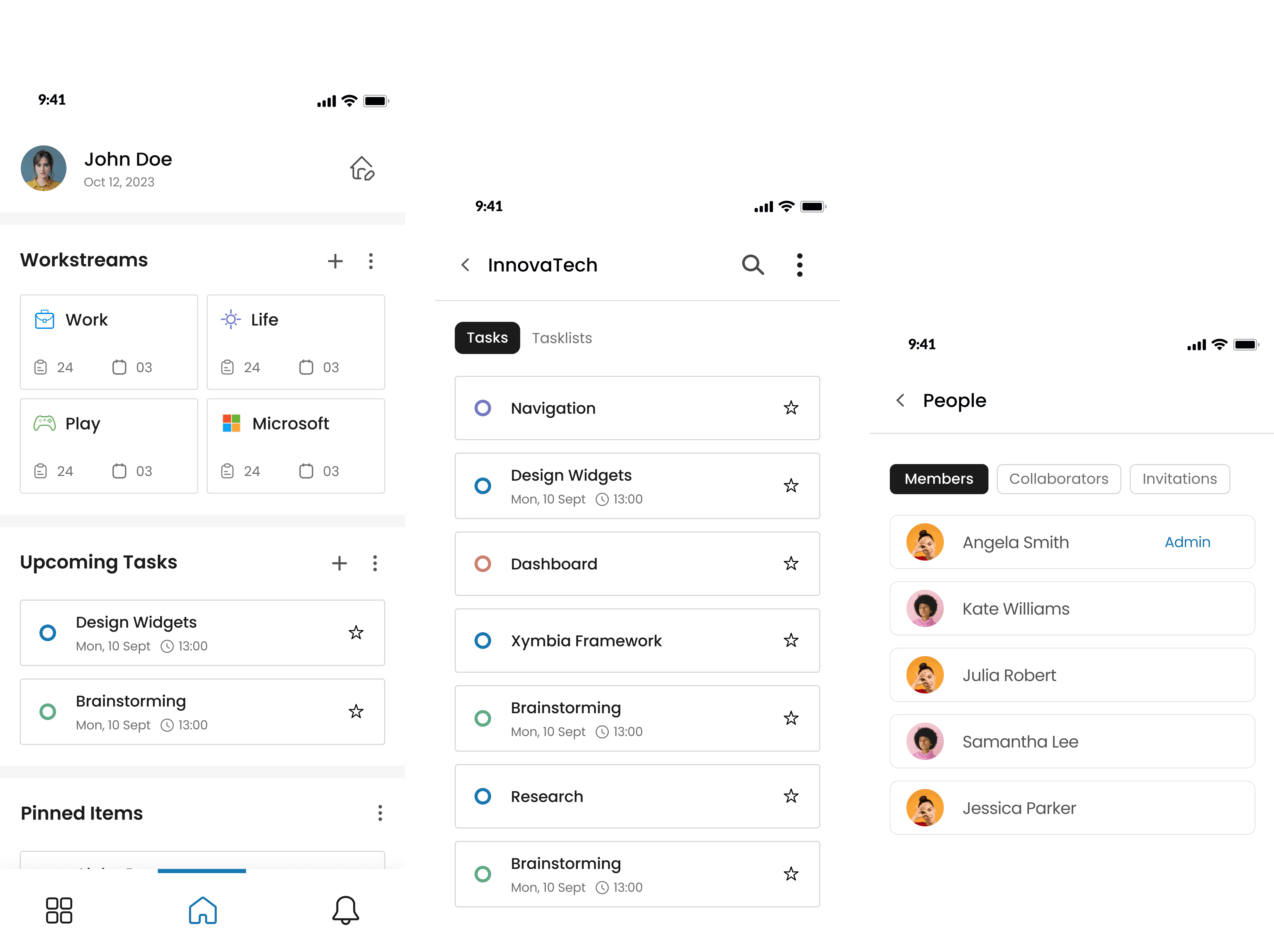
Workstreams: From Wireframes to Final Product
The workstream app, a core component of the product, required extensive iteration. I started with initial wireframes to establish the basic layout and functionality. Through stakeholder feedback and multiple design iterations, I refined the user flow and interactions.
One of the major design changes included the introduction of cards for task management, swipe actions for task interactions, and three-dot menus for additional options. Long press menus, re-ordering capabilities, and bulk actions were incorporated to enhance flexibility and efficiency.
After several rounds of testing and feedback, I finalized the design, focusing on user flexibility and ease of use. The iterative process ensured that the final design was both intuitive and functional, meeting the needs of diverse users.


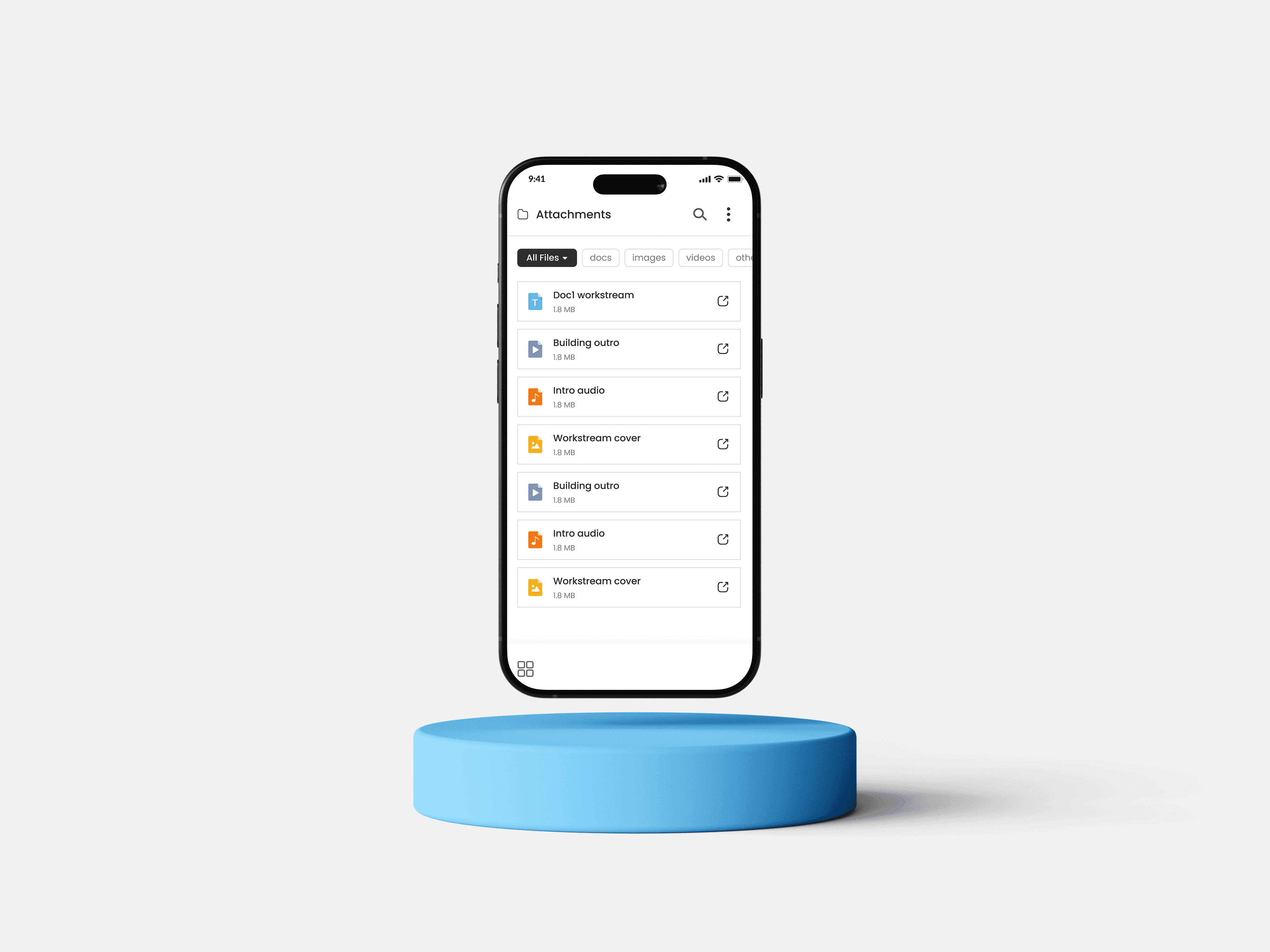
Streamlining Attachments
The file attachments module required improvements to manage and share files associated with tasks effectively. I designed a dedicated module with filtering and sorting options, allowing users to categorize attachments into "My Files" and "Shared with Me."
A notable challenge was developing a sharing feature that catered to both ProductiveApp members and non-members. Drawing inspiration from Instagram’s sharing flow, I created a seamless experience for sharing attachments, ensuring ease of use for all users.
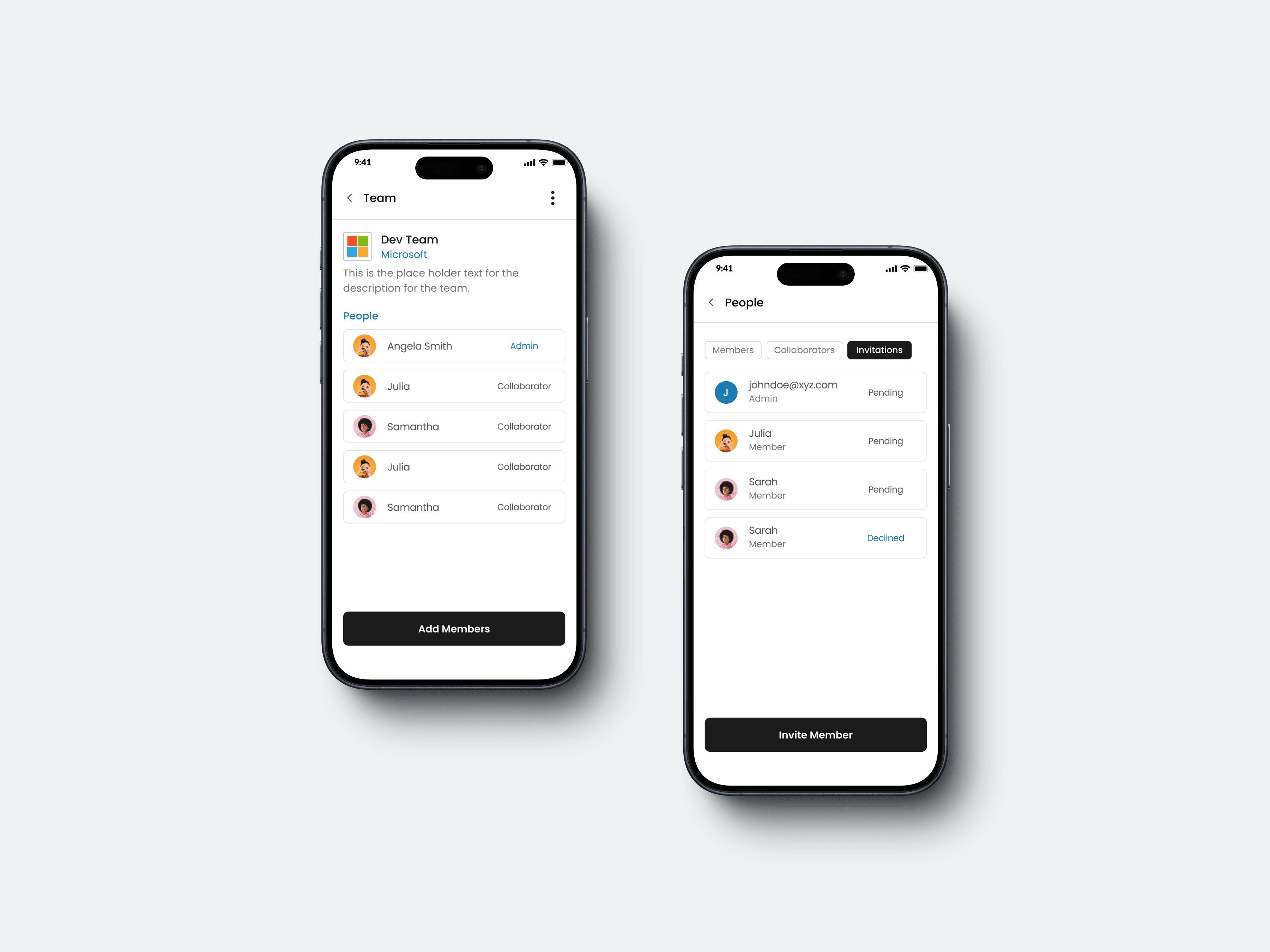
Designing the Organizations Module
The organizations mini app needed to manage teams and organizations effectively. I designed a system that allowed teams to be linked to organizations, with clearly defined roles and permissions such as owner, member, and external collaborator.
One of the unique aspects of this feature was the introduction of independent teams, which was not available in competitor products. This allowed users to create and manage individual teams that were not necessarily linked to an organization, offering greater flexibility and catering to a broader range of user needs.
Developing a Cohesive UI Kit
Throughout the project, I worked on creating a UI kit to maintain design consistency across different components. Using an atoms and molecules approach, I organized components into a coherent system, which facilitated a unified design language across the app.
iOS & Android
Worksphere
My Role
My Role
UX Designer - Interaction Design
Visual Design, User Flows, Prototyping
Project Duration
Project Duration
Sept 2023 - Feb 2024
Overview
Overview
Worksphere a powerful productivity tool designed to help you effortlessly manage tasks, calendars, and team collaboration in one integrated platform. It streamlines complex workflows and provides a flexible, intuitive experience to boost your productivity, to keep you focused on what matters most.
The Problem
When I joined Worksphere as a UX Designer, I was tasked with revitalizing their productivity tool, which initially featured only a logo and a minimal user interface. My mission was to transform this nascent product into a sophisticated and user-friendly solution. I spearheaded several design initiatives to enhance usability, functionality, and overall user experience throughout the course of the project.
Onboarding
When I began, there was no onboarding process, which led to user confusion and a lack of engagement. To address this, I designed an onboarding experience that would engage users right from the start.
I crafted a series of screens to clearly indicate the purpose of the product, providing users with a personalized experience. Key features included automatic detection for login or sign-up via email, significantly reducing cognitive load, and integrating calendar linking during onboarding to streamline the setup process. Additionally, I offered a preview of the product's value proposition.
Upon reflection, I realized that reducing the number of onboarding screens would help prevent drop-offs due to lengthy processes. I recommended moving the calendar setup to a later stage within the app, ensuring a smoother initial experience.
Crafting a Personalized Dashboard
Initially, the tool lacked a functional and engaging dashboard. To address this, I designed a dashboard that was both exclusive and valuable. I introduced pluggable widgets, allowing users to customize their dashboard based on their preferences and priorities.
This approach not only handled the complexity of the tool but also offered users the freedom to arrange their dashboard to best suit their needs. By implementing this flexibility, users could focus on what mattered most to them, enhancing their overall experience with the product.
Implementing an Intuitive Navigation System
Implementing an Intuitive Navigation
System
Given the planned expansion of the app to include multiple modules, navigation was a critical concern. The existing system was cumbersome, making it difficult for users to move seamlessly between different parts of the app.
To resolve this, I designed a nested navigation system featuring a global navigation menu for accessing all modules. Once inside a module, users encountered in-app navigation complemented by a back button, facilitating smooth transitions and reducing navigation-related frustration.
Workstreams: From Wireframes to Final Product
Workstreams: From Wireframes to
Final Product
The workstream app, a core component of the product, required extensive iteration. I started with initial wireframes to establish the basic layout and functionality. Through stakeholder feedback and multiple design iterations, I refined the user flow and interactions.
One of the major design changes included the introduction of cards for task management, swipe actions for task interactions, and three-dot menus for additional options. Long press menus, re-ordering capabilities, and bulk actions were incorporated to enhance flexibility and efficiency.
After several rounds of testing and feedback, I finalized the design, focusing on user flexibility and ease of use. The iterative process ensured that the final design was both intuitive and functional, meeting the needs of diverse users.


Streamlining Attachments
The file attachments module required improvements to manage and share files associated with tasks effectively. I designed a dedicated module with filtering and sorting options, allowing users to categorize attachments into "My Files" and "Shared with Me."
A notable challenge was developing a sharing feature that catered to both ProductiveApp members and non-members. Drawing inspiration from Instagram’s sharing flow, I created a seamless experience for sharing attachments, ensuring ease of use for all users.
Designing the Organizations Module
The organizations mini app needed to manage teams and organizations effectively. I designed a system that allowed teams to be linked to organizations, with clearly defined roles and permissions such as owner, member, and external collaborator.
One of the unique aspects of this feature was the introduction of independent teams, which was not available in competitor products. This allowed users to create and manage individual teams that were not necessarily linked to an organization, offering greater flexibility and catering to a broader range of user needs.
Developing a Cohesive UI Kit
Throughout the project, I worked on creating a UI kit to maintain design consistency across different components. Using an atoms and molecules approach, I organized components into a coherent system, which facilitated a unified design language across the app.